Colour Theory for Yarn Crafts
Published on 13 March 2019 By Mara 6 min read
Brittany from BHooked Crochet, a talented crochet teacher and designer, is totally head over heels in love with colour! Her crochet patterns feature eye-popping colour combinations for every style and taste. So, who better to introduce the concept of colour theory and how you can use it to plan your next project than Brittany herself!
What is colour theory (and how can it relate to crochet?)
Colour theory blends two of my favourite things - science and art. It explains our conscious awareness of what’s around us; the colours we see, how they blend and how they make up our world. It’s a visual form of communication and we can use it to express a thought, feeling or emotion in our crochet projects.
What’s even better? You can create a memoir through your crochet projects with what you’ll learn here today about colour theory and how it relates to crochet.
The colour wheel
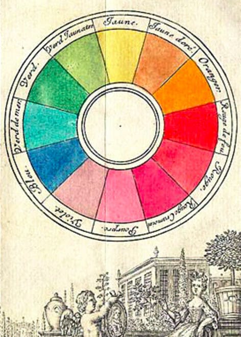
Although "colour theory" has several facets of meaning, when you hear the phrase, you’re likely to visualise a colour wheel. Am I right?
The first colour wheel was created by Sir Isaac Newton in 1666. It has gone through many changes and transformations along the way but designers and artists still use it today to develop colour harmonies and create a palette that is visually appealing.
The colour wheel is the most valuable tool in my designer’s toolkit. I use it and the principles we’ll discuss here to plan each of my designs.
Primary, secondary, and tertiary colours
The colour wheel is based on the three primary colours: red, blue, and yellow. These three colours cannot be formed by mixing any combination of colours. They are the foundation for all colours.
Secondary colours are green, orange, and purple and are the result of blending primary colours. When you mix yellow and blue, the result is green; yellow and red, you get orange; red and blue, you guessed it, purple.
Have you ever looked at a crochet project with yellows, reds, and oranges and felt energised, excited or happy? That’s because warm colours instill these thoughts, feelings and emotions into our minds.
What about the feeling you had when you laid eyes on a project with blues, greens, or purples? I bet you felt calm, relaxed and maybe even peaceful. Cool colours are known to evoke these emotions when we look at them.
Using the colour wheel to plan your crochet projects
Now the question we crocheters have - how do I pick colours for my projects? The answer is in the schemes. Colour schemes, that is!
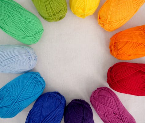
Using the colour wheel, you can make this daunting task a little more fun. When browsing through the various shades of yarn available, have a colour wheel image handy and remember the three main colour schemes: complementary, analog, and triadic.
Complementary colours
Complementary colours are two colours that are opposite on the colour wheel like purple and yellow, blue and orange, or red and green.
Choosing complementary yarn colours can really make a statement because there is a sharp contrast between the two, incorporating a warm and cool colour.
Now let’s say you’d like to make a project with more than two colours. Can you still use complementary colours? Absolutely! Let’s say you want to use the complementary colours purple and yellow. Using the tertiary colour wheel, you can pull out one or two variants of purple and yellow to pair in your project.
Analogous colours
Analogous sit beside one another on the colour wheel. For example, purple, blue, and green.
I find that using analogue colours is one of the easiest ways to plan a crochet project with colour! On my colour wheel here, I picked four neighboring colours to jump start the project planning process.

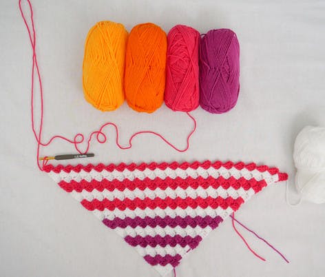
Do you see the harmony here? These colours make me feel bright, cheery, and energised; the exact emotion I want to portray in a baby blanket!
To make these colours pop even more, I have paired them with white as the main colour, clearly defining each colour. That separation is great to have with colour analogues because they are often very close to one another. More on choosing main colours in a bit!
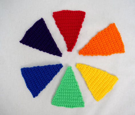
Triadic colours
Another way to plan colours for your crochet projects is to use triadic colour schemes. Triadic colours are three equally spaced colours on the colour wheel and tend to be very bright and dynamic. For example, orange, yellow and blue.
Using a triadic colour scheme is a great way to balance contrast and harmony in one fun crochet project.
Colours and the emotions they evoke
Our projects are more than a way to occupy our hands. Yarn isn’t just something we do, it’s who we are and through yarn and the projects we create with it, we can create a memoir.
As you’re planning your next project, tap into your current state of mind. What are you feeling or how are you trying to make the recipient of your gift feel? Use this as a guideline when planning the colours you would like to incorporate in your project.
Red: Red is a special colour. It has the ability to make us feel opposing emotions ranging from passion and love to anger and aggression.
Orange: Orange is a bright and balanced colour giving us feelings of energy and friendliness.
Yellow: Yellow is the brightest of all colours portraying energy, hope, laughter, and happiness.
Green: Green is a symbol of health, wealth, and new beginnings. It’s easy on the eyes and can instill feelings of calm and relaxation into your projects.
Blue: Ah blue. My favourite colour! Blue portrays feelings of calmness and trust. Like green, blue is pleasing to the eye and can make you feel calm and relaxed.
Purple: Purple evokes creativity and soothes those who see it. It is also associated with royalty and luxury.
Picking a main colour
Once you have chosen your colour palette based on what we have seen so far, the final step in planning your project is to pick a main colour.
Black, gray, tan, and white (and all the variants within) are defined as neutral colours and are a good choice for a main colour in your project. Although you can pair any of these neutrals with your chosen colour palette, think about the context when making your selections.
How colours “behave” with one another is the basis of colour context. Do you want the colours to pop or blend?
Black and white are great choices when you are using bright colours and you want them to pop. Alternatively, gray and tan are great choices when using cool colours you want to blend and be a little more soothing and relaxing.
To learn more about the skills you need to plan and execute stunning projects, check out the Bhooked Crochet site.
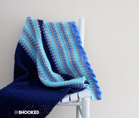
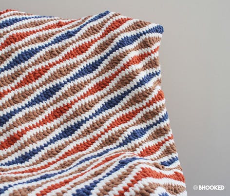
Our favourite free colourful patterns

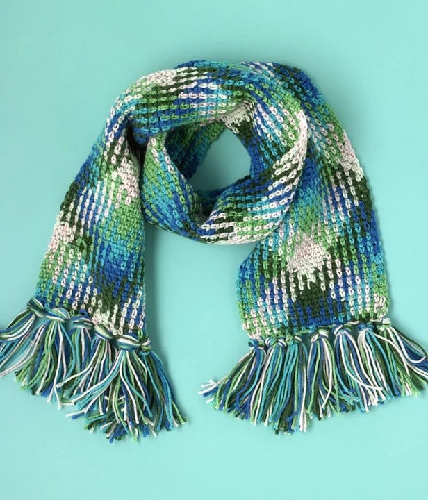
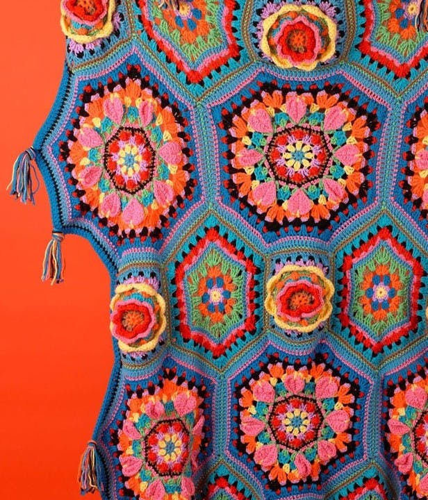
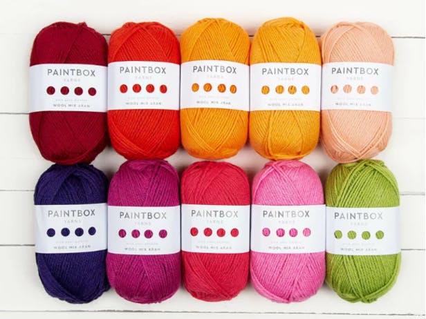
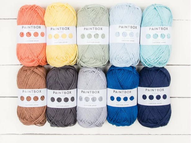
Get your own kaleidoscope of yarns!
You might also like
-
Guide
Mystic Merion picks your next project based on your star sign!
-
Roundup
The top craft trends of 2022 revealed!
-
Guide
New collection: Highland Fling by Debbie Bliss, a celebration of the British Isles
-
Tutorial
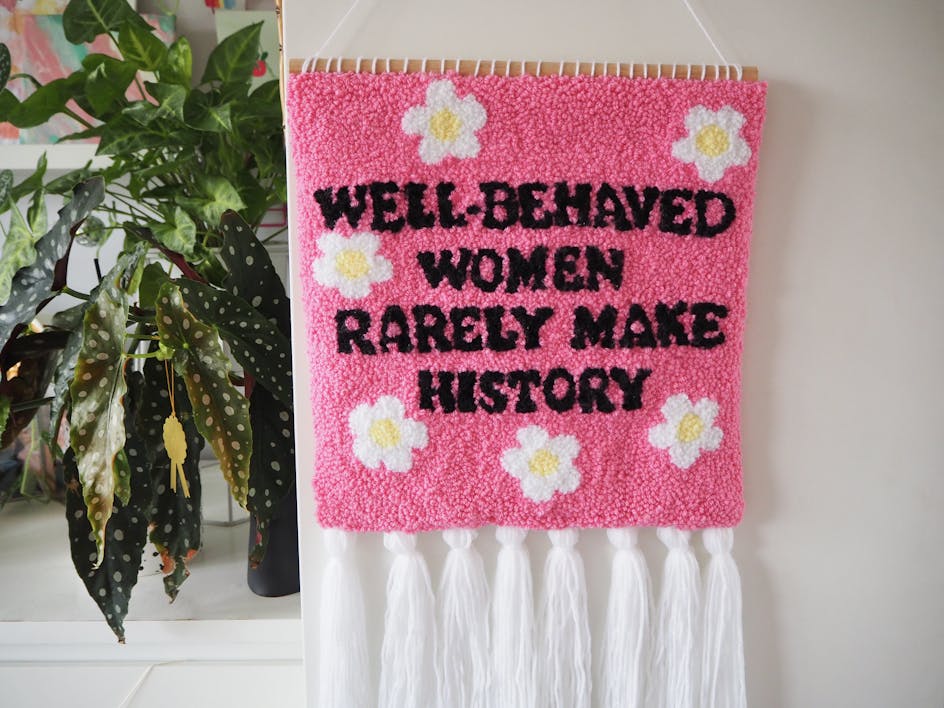
Free DIY feminist punch needle wall hanging tutorial!
-
Roundup
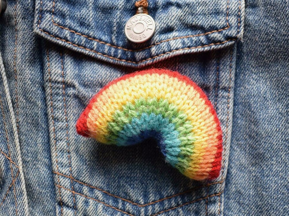
13 cheerful rainbow patterns to spread joy
-
Roundup
The creators of self expression
-
Tutorial
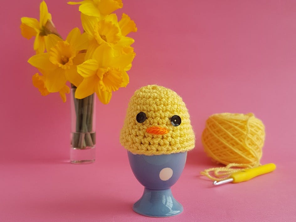
Crochet a chick egg cosy with Emma Friedlander-Collins
-
Guide
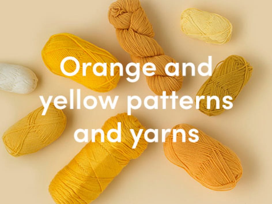
Knitting in orange and yellow - from palest lemon to deepest marmalade